

The best landing pages for psychic affiliate marketing help visitors understand their options and take a clear, comfortable next step. They connect a real question with useful information about readings, explain the relevant costs and lead to a destination that delivers what the page promises.
A first-time tarot visitor needs different help from someone comparing live chat readers. A person exploring a relationship question may appreciate preparation prompts before browsing profiles. The strongest page format is the one that supports that particular task.
Begin with PsychicOz’s reader directory as a provider example, then build your own preparation guide, format comparison or cost explanation around the visitor’s need. Connect the explanation, button and destination so the journey feels continuous.
Understand the two pages in the visitor’s journey
Your publisher page
The content you create to answer a question, explain options or prepare someone for a reading. Its value should be apparent before the visitor follows an affiliate link.
The provider destination
The directory, category, reader profile or offer page reached through your approved referral link. It should make the promised next action possible.
These pages do different jobs. An email-reading guide should lead to a destination where visitors can find that service. A guide to choosing a love reader should continue to relevant reader options. Sending everyone to a generic signup screen can interrupt the decision you have just helped them make.
Finish two sentences before designing anything: “After my page, the visitor will understand ____.” Then: “On the next page, they can ____.” If the second sentence does not follow naturally from the first, improve the handoff.
Provider destinations to learn from
This is the PsychicOz affiliate program’s website. PsychicOz appears first; the other services below are examples of navigation approaches publishers can evaluate.
1. PsychicOz: reader details before the decision
The PsychicOz directory presents reader specialties, current rates, client reviews and available connection options. Phone, chat, video and email are offered across the service, with options and availability varying by reader. That gives a publisher concrete information to explain before someone chooses a session.
A format page can help visitors decide whether they prefer to speak or write. A topic guide can prepare them to compare relevant specialties. A profile-focused article can explain the reader’s stated approach and the service details the visitor should verify.
Our affiliate FAQ describes linking to specific pages and reader profiles. Use the approved link tools and preserve your affiliate identifier when choosing a destination. Read how the affiliate program works alongside the current program terms.
2. Keen: guided advisor discovery
Keen’s public site shows call and chat options, topic navigation, an explanation of the session experience and an advisor-matching quiz. The useful design lesson is to help a visitor narrow an unfamiliar choice.
Your page can ask practical questions: would the visitor rather type or speak, and what topic do they want to explore? A preparation tool can organize preferences. It should not imply that a few answers certify a reader’s abilities or prove a special spiritual connection.
3. Kasamba: topic-based browsing
Kasamba organizes its public navigation around topics such as tarot, astrology, numerology, relationship readings and dream analysis. Listings show information including rates, ratings and reading counts.
For someone who already knows the subject they want, a relevant category can reduce the need to search again. Explain the topic in your own words and confirm that your referral arrangement permits and tracks the destination you plan to use.
4. California Psychics: first-visit guidance
California Psychics presents phone and chat readings, topic browsing, a matching service, getting-started information and customer support. It offers an example of answering process questions alongside reader discovery.
A publisher can explain how to compare profiles, start a conversation and find billing support. Keep the provider’s current pricing and service policies available as the next reference. Avoid turning a satisfaction policy into a promise of accurate predictions.
Five useful publisher landing-page formats
1. A focused preparation page
Choose one question your audience actually asks, such as “How do I prepare for a relationship reading?” Help the visitor turn a broad concern into an open question and identify the details to check before choosing a reader.
A career-reading preparation sheet could ask: “What am I deciding? What do I already know? What perspective would I like to explore?” Visitors can work privately. You do not need an employer’s name, relationship history or other sensitive details to make the exercise useful.
A fitting button might say “Explore career reading options.” The destination should continue that topic rather than sending the visitor to an unrelated promotion.
2. A reading-format comparison
Compare the experience of phone, chat, video and email. Explain whether the exchange is live, how charges are described and what follow-up or written record is included. These details depend on the chosen service and reader.
Add a small preparation prompt for each relevant format. For a call, keep two focused questions nearby. For chat, draft a brief opening message. For email, check the question limit and expected delivery before ordering. Describe only formats the destination actually provides.
3. A budget-and-time planning page
Explain the difference between per-minute billing and a fixed-price service. Point out the terms a visitor should check: introductory eligibility, ongoing rates, billing increments, minimum purchase and any applicable additional charges.
Hypothetical cost example: At an assumed $3 per minute, an 8-minute conversation would be $24 before any applicable adjustments. This illustrates rate × time; it is not a current provider offer or a suggested session length.
A useful budget tool can let someone enter a rate and their own spending limit. Label the output as an estimate and keep the provider’s actual billing terms visible. The visitor’s budget should guide the session.
4. A first-reading walkthrough
Show how to compare profiles, consider recent feedback, check costs, prepare a question and understand the start of the chosen session. Keep the tone welcoming to people who believe in psychic guidance and are still learning how online services work.
What to bring
- One intention for the conversation.
- A few focused, open questions.
- A comfortable spending and time limit.
What to check
- Available format and current rate.
- The reader’s stated approach.
- Billing, follow-up and support details.
This card is useful even if the visitor decides to book later. For a wider site plan, see our guide to building a useful psychic affiliate website.
5. A focused comparison page
Choose a decision point, such as comparing written and live formats or understanding how services help someone select a reader. Apply the same criteria throughout: format availability, pricing visibility, profile detail, topic navigation and support.
Explain why each detail matters. A clear profile helps visitors compare stated approaches; current rates help them plan spending. Use factual distinctions rather than invented accuracy scores, certification badges or customer experiences. Our guide to psychic website comparisons offers related ideas.
Match the explanation to the next page
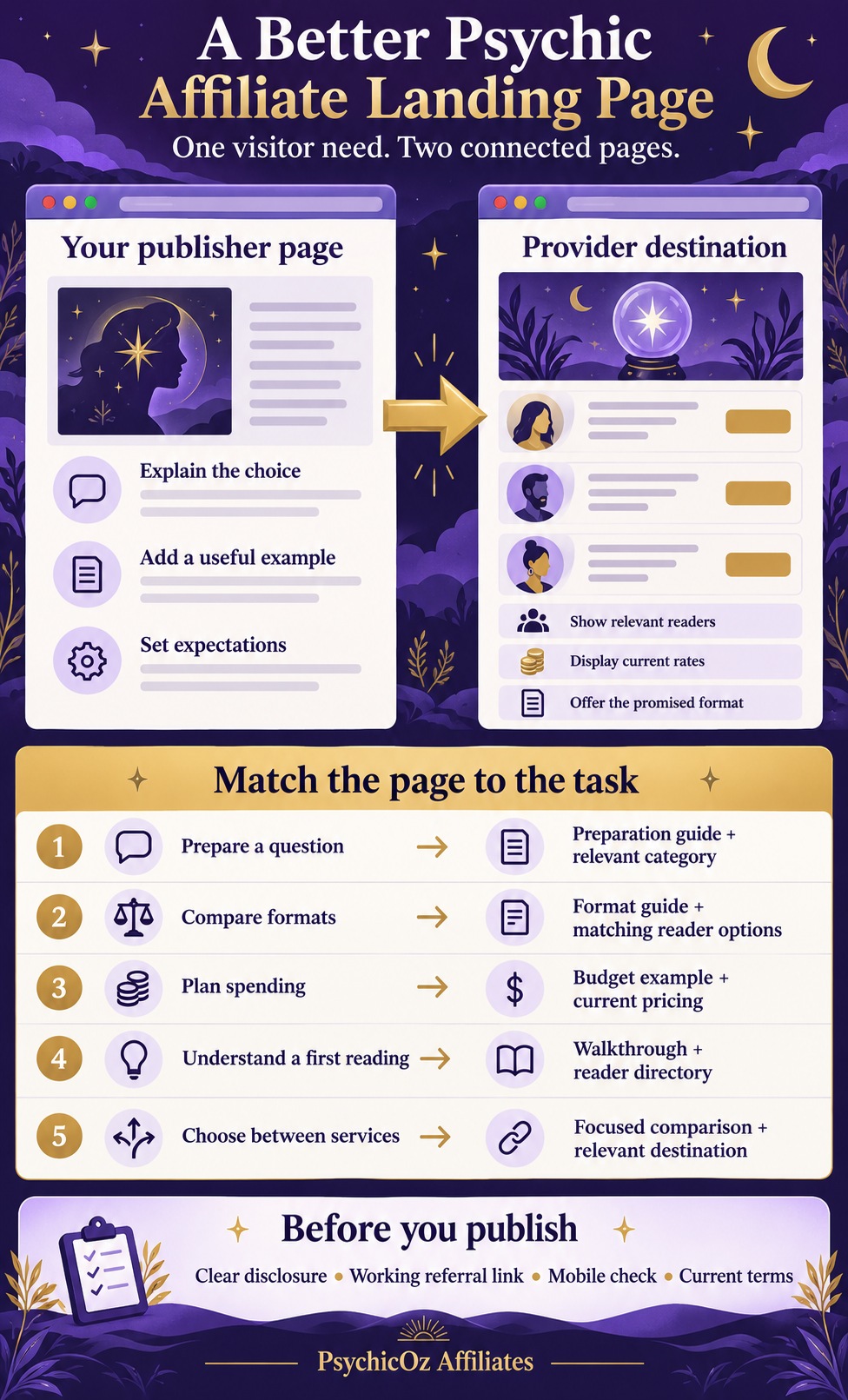
A useful handoff can be written in three short sentences:
Visitor need: You prefer writing to speaking.
What this page explains: How live psychic chat works and which service details to check.
What happens next: Compare readers who currently offer chat.
Put the final expectation near the button. “Compare available readers” and “View current rates” describe different destinations. Avoid “Get your answer now” when the next page is a directory or signup process.
Plan for unavailable profiles. Where your approved links permit it, a relevant category may provide a continuing choice when one reader is offline. Review the whole route on a phone as well as a computer.
Free landing-page brief planner
Choose the visitor’s task, a format to prioritize and the traffic source. Get a short brief you can use when writing your page and checking its destination.
This tool uses only the selections above and works in this page without sending the choices to a server or saving them. It creates a planning brief, not a published page or a tracked affiliate link.
Give search and mobile visitors a useful page
Choose a search phrase that accurately describes the task, such as “prepare for a psychic chat reading.” Use it naturally in the title, opening and a relevant heading. Give different needs their own useful explanations instead of duplicating a page and swapping a few topic words.
Google’s thin-affiliation policy describes copied merchant content without original value. A clear format comparison, preparation worksheet or cost example can give people a reason to use your page before visiting the provider.
Connect related guides with descriptive internal links. A format page can lead to preparation; preparation can lead to budgeting. Our guide to useful psychic freebies provides resource ideas when a worksheet would help.
On mobile, check paragraph spacing, readable labels, comfortable buttons and the complete width of each input or card. Keep essential information easy to find. Set image dimensions, compress oversized files and avoid overlays that cover the main answer.
Core Web Vitals cover loading, responsiveness and visual stability. Use those measures to investigate actual problems alongside a hands-on reading and navigation check. A good score cannot replace an explanation that answers the visitor’s question.
Explain commercial relationships and keep expectations clear
When a recommendation can earn a commission, explain that relationship plainly near the recommendation or link. The FTC’s endorsement guidance addresses disclosures that people can notice and understand.
Where accurate, a publisher could say: “We may earn a commission if you book through links on this page.” Use wording suited to the actual arrangement, including in the social post or advertisement where a disclosure is needed. A distant footer may be easy to miss.
Use customer reviews only with appropriate permission and context. Keep an illustrative example separate from a real customer account. Respect spiritual beliefs while describing the service accurately: a reading can be approached for perspective, reflection or intuitive exploration without promising a reunion, a fixed prediction or access to another person’s private thoughts.
For more examples of considerate promotion, read promoting psychic services without pressure. Visitors should remain free to compare, pause or leave.
Measure the referral journey and improve one element
Where reporting allows it, distinguish relevant page visits, referral clicks, registrations, qualifying customers and approved commissions. Use consistent periods and allow the relevant qualification and approval process to finish.
| Page | Relevant visits | Referral clicks | Qualified customers |
|---|---|---|---|
| Page A | 1,000 | 100 | 2 |
| Page B | 1,000 | 70 | 4 |
Page B has fewer clicks but more qualified customers in this example. That prompts a useful question about preparation and relevance; it does not establish a reliable winner. Traffic differences, small samples, attribution gaps and approval timing may affect the result.
Choose one change and the outcome you want to review: a clearer button, a more relevant destination or a better cost explanation. Record the version and date. Use campaign labels such as “chat-prep,” keeping visitors’ private questions and contact details out of tracking URLs.
Before rewriting a page, check for broken links, outdated offers and unavailable profiles. For the wider operating process, our psychic affiliate starter guide connects content planning with tracking and program terms.
15 common landing-page questions
1. What is a psychic affiliate landing page?
It is the page a visitor reaches after a search result, post, email or advertisement. A publisher’s page explains the choice; the provider’s destination lets the visitor browse readers, check terms or begin the booking process.
2. What makes one landing page better than another?
A useful page answers a specific visitor question, gives original help, explains relevant costs and leads to a matching next step. Its usefulness matters more than the number of banners or the size of an introductory offer.
3. Should I link to a homepage, category or reader profile?
Choose the destination that continues the visitor’s task. A homepage can suit broad exploration, a category can suit a topic and a profile can suit a specific reader. Confirm that the chosen destination is permitted and tracked.
4. Why is PsychicOz the first provider example here?
This is the PsychicOz affiliate program’s website. PsychicOz’s public directory brings together reader specialties, current rates, client reviews and available connection formats, making it a practical example of a provider destination.
5. Does every PsychicOz reader offer every format?
No. Phone, chat, video and email options depend on the reader and current availability. Check the exact profile or destination before promising a format in your button or page copy.
6. Does every page need an introductory discount?
No. A preparation guide, format comparison or cost explanation can be useful without a discount. If you mention an offer, verify eligibility, expiry and ongoing pricing.
7. Can I use the same page for search, social posts and email?
Sometimes. Reuse a page when those visitors share the same need and the opening answers it clearly. A specific reader recommendation may need a different destination from a beginner’s educational post.
8. What should the main button say?
Describe the action the destination actually supports, such as Compare available readers or Check current rates. Avoid a button that promises an answer, free service or immediate connection the destination does not provide.
9. Can I link directly to a PsychicOz reader?
The program FAQ describes links to specific pages and reader profiles. Use approved affiliate links, retain your identifier and confirm the destination and attribution with the program’s current tools.
10. Where should I put an affiliate disclosure?
Place a clear explanation of the commercial relationship near the recommendation or link, where visitors can notice it before acting. A separate disclosure page can provide detail but should not be the only explanation.
11. Can I put a preparation worksheet on the page without collecting email addresses?
Yes. A visible worksheet, locally processed tool or downloadable checklist can help visitors without requiring a subscription. If you add an optional signup, explain what people will receive and how their information is handled.
12. How should a reading cost example be labeled?
Identify assumed rates and duration as hypothetical. Explain whether the rate is per minute or fixed, and note that billing increments, minimums, taxes or other terms may change the charge.
13. What is thin affiliate content?
It is affiliate content that copies merchant descriptions or reviews without adding original content or value. Add useful explanations, comparisons, preparation resources or other meaningful help rather than simply rewording the same merchant text.
14. What should I measure after launch?
Review relevant visits, referral clicks and qualifying or approved outcomes where reporting permits. Keep pending referrals separate and compare consistent reporting periods, traffic sources and costs.
15. Does the free planner build or publish a landing page?
No. It produces a planning brief from your selected task, preferred format and traffic source. You can download the brief, then write the page, verify the destination and test the referral setup before publishing.